
Project Details
"How might we unify the user experience across different touchpoints throughout myFICO?"
Situation
Based on the stakeholder interviews I conducted when I joined myFICO, one of the goals was to ensure myFICO brand has consistent product design experience across different channels and platforms. In order to make it happen, myFICO product design team decided to create our own design system from scratch. We wanted to make an impact to the business and stated the benefits of creating this single source of truth which are:
- Simplifies the entire design process
- Enhancing design efficiency by using custom UI components developed by our team.
- Ensure consistent myFICO look and feel across touchpoints
Luckily, our idea had the full support from the stakeholders.
Tasks
Our goal was to create a design system that omit as much platform differences as possible. The most challenging and important part of the whole process is to analyze and identify which UI components to be identical across platforms, which UI components are acceptable to be unified across platforms as well as which UI components need to be platform-specific. We worked with the PMs and Engineering to make the final decision to ensure this brand new design system will be viable with our business and feasible with our system.
Divide myFICO UI components into 4 buckets
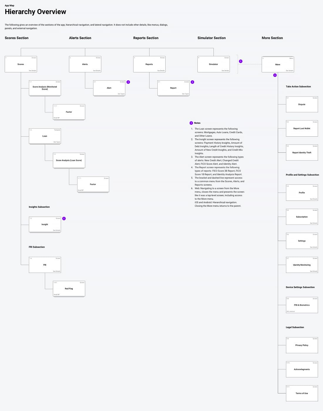
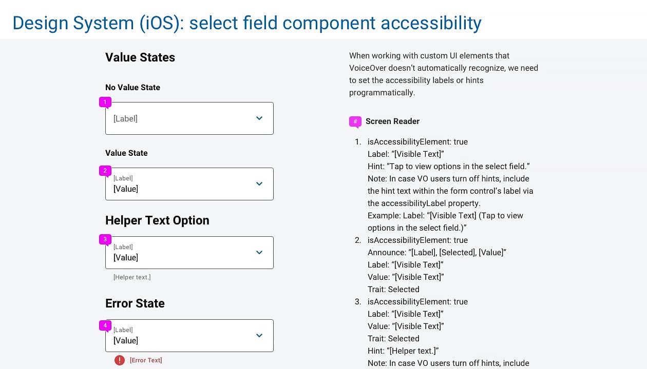
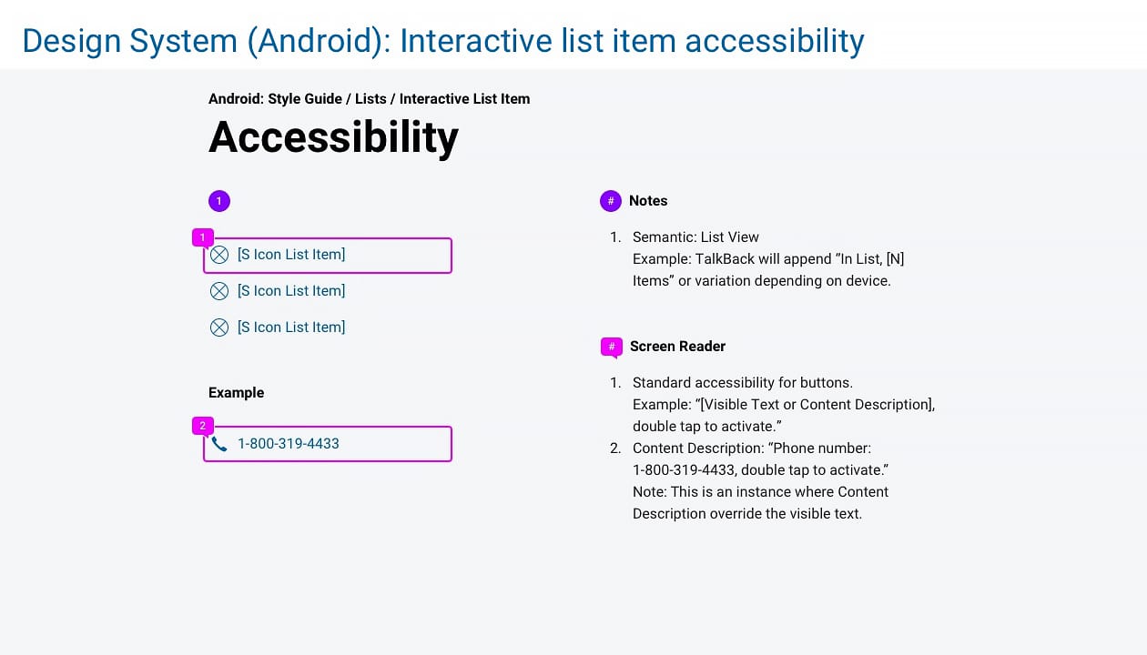
I worked with another two designers on creating UI components, style guides, UI specs, accessibility specs, different flows and app map for myFICO product which includes web app, native apps, marketing, email and forums.
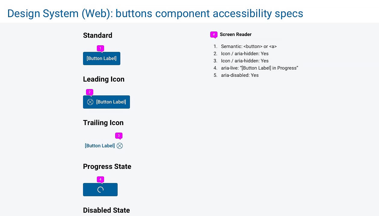
I've learned a lot during the whole process because we handled interactive states, UI and ADA specs as well as style guides across all platforms. The ADA specs for native apps was challenging because it's new to us and we need to check several sources as well as collaborating with Engineering in order to make sure our spec is correct.
Action
Analysis step:
We analyzed our UI into 4 different buckets in order to identify each UI characteristics into different buckets.
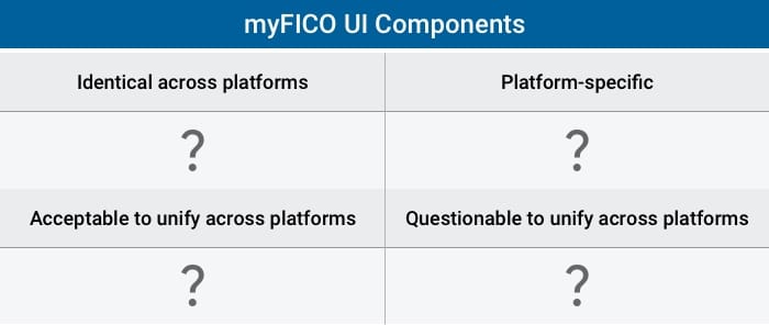
- Bucket 1: Identical across platforms - for example, full-screen dialog type for all platforms.
- Bucket 2: Acceptable to unify across platforms - for example, stacked label value info list for all platforms to omit iOS row in table view with left-justified label and right-justified value.
- Bucket 3: Questionable to unify across platforms - for example, custom select control for all platforms. We decided to use down chevron for the indicator instead of filled triangle in Materail Design or no indicator in iOS.
- Bucket 4: Platform-specifc - for example, screen title, back button, top and bottom bar background etc.
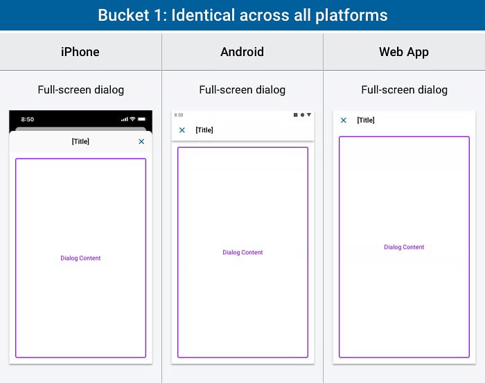
Bucket 1 - identical across all platforms; we use full-screen dialog type on all platforms as an example.
Creation step:
In terms of the creation process of the design system, below are the highlights of the work I am the most proud of:
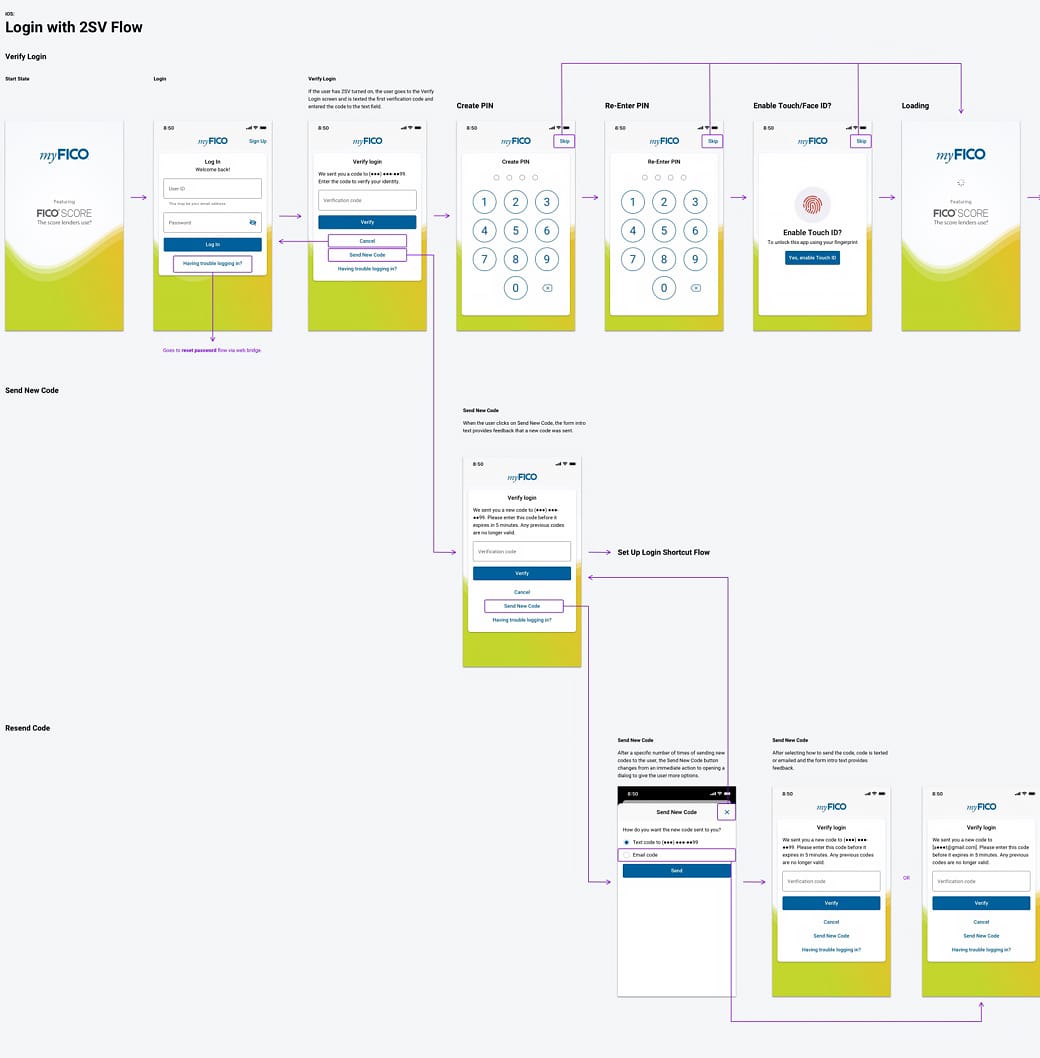
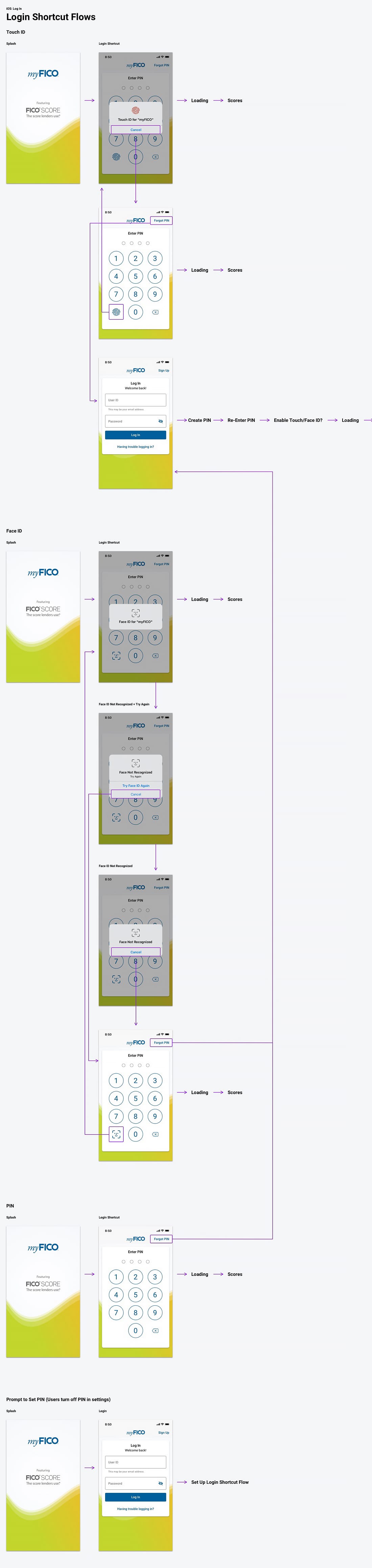
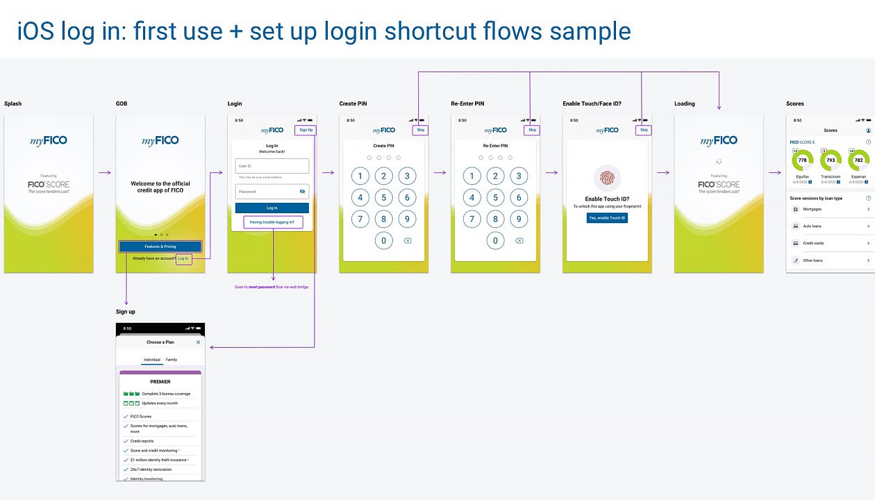
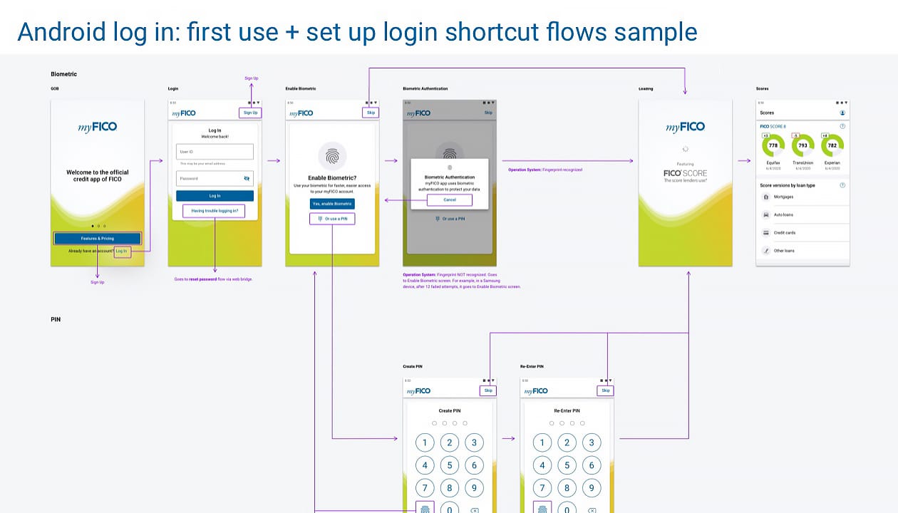
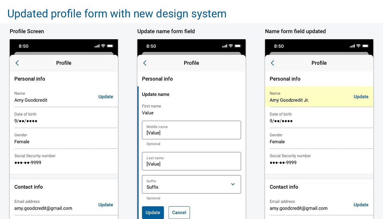
- Created the entire flows and visual brand design of login, including the flows of first use, various login shortcuts, login with 2-step verification, guest onboading in the native apps, and reset password flows in the web app. All states, UI and ADA specs are included in the deliverables.
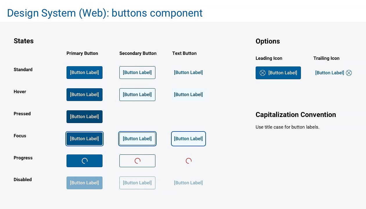
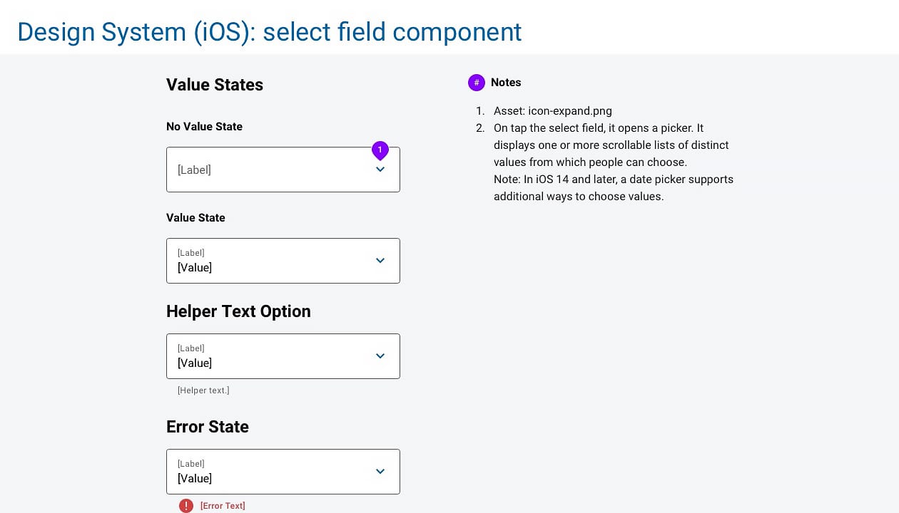
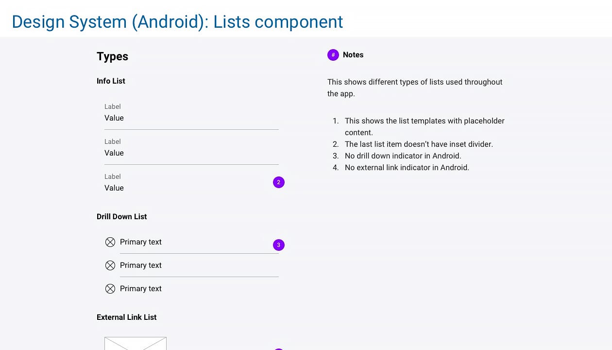
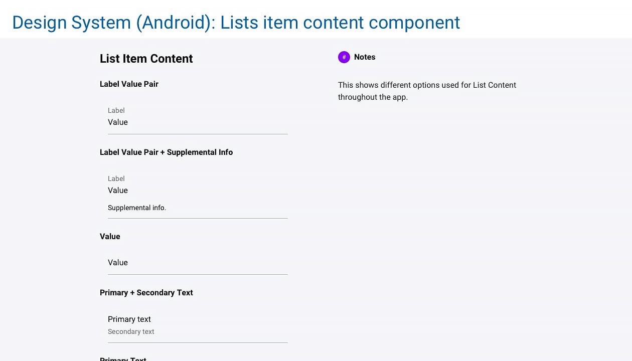
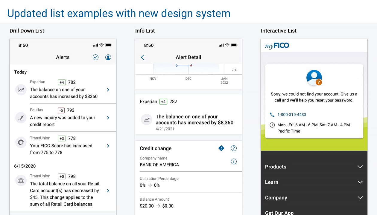
- Created UI components with various interactive states, UI and accessibility specs as well as style guide across all platforms, including custom form designs, lists, tab control, radio control, vertical stepper, side nav, buttons, long text block, slider, typography, empty states, promo banner, switch control and dynamic type (iOS) etc.
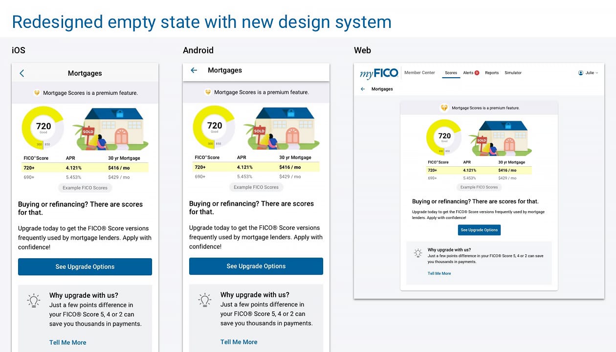
- Redesigned the empty states which resulted in lifting the conversion rate.
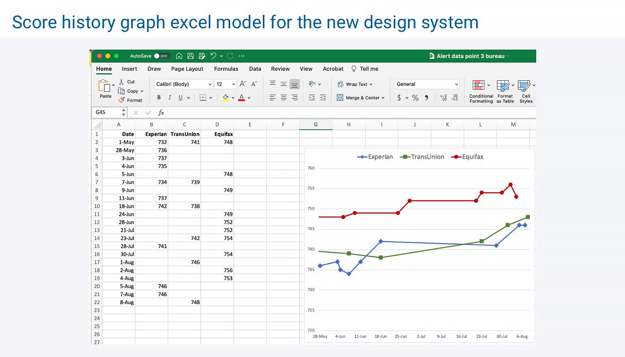
- Figured out the data points of the Score History Graph for all 3 bureaus which is used in Scores and Alerts screens in our apps. It also passed legal approval.
- Created a dynamic Excel chart to communicate with Engineering the data points to use in order to match the design to be used in the App Store.
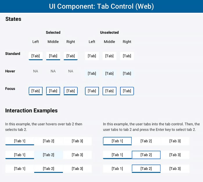
Tab control UI component interactive states and interaction samples.
Result:
A beautifully-crafted unified design system across all platforms which simplifies the entire design process and streamlines the collaboration with Engineering over the single source of truth to refer to.