Project Details
Situation
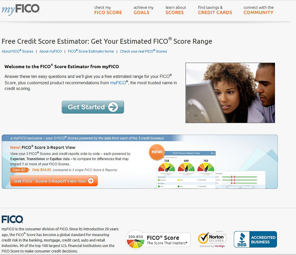
The myFICO Score estimator is our top 1 entry page from organic search when people search for FICO Score but the exit rate is high because users don’t finish the 10 questions to get their estimated FICO Score result. People either close the browser or drop the process entirely around the question 4 or 5. This shows that users get frustrated while trying to complete the wizard. Also, the old estimator design is not mobile optimized which means the old design is completely not usable on mobile. This is a serious usability problem that we really needed to solve.
The goal was to come up with a redesign that’s intuitive and easy to use in order for them to complete the 10 questions to get their estimated FICO Score. The success metric we set for this project is the completion rate.
Tasks
Redesign our myFICO Score estimator.
Action
I started out by looking at the old design flow and some benchmark data in the past to see at which step people dropped out. The findings are listed below:
On the design side:
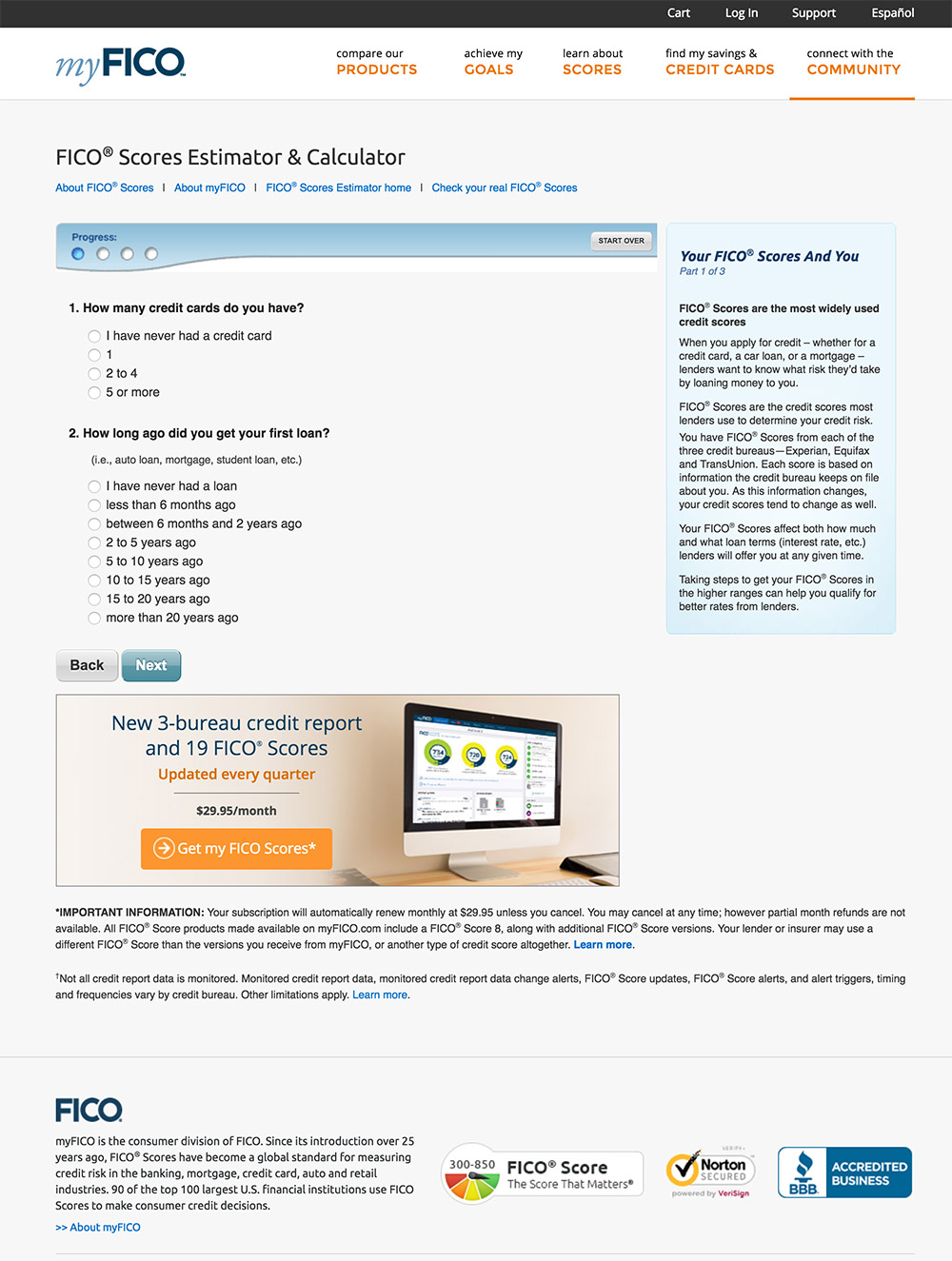
- Small font size - the font size is too small. It was 12/14px so it slows down the users’ readability.
- Too much noise - There is too much noise on the page in users' peripheral vision area which will distract the user from finishing the wizard. We don’t want to take users away from finishing the wizard. For example, there are too many clickable links around the wizard; there are ads around the wizard to encourage users to click and be taken to another page.
- Small clickable target area - The clickable target area for answers is too small. The old design was using radio buttons for each answer plus there is not enough space in-between each answer. It is an accessibility issue because small radio buttons are really hard to use for people with trembling hands.
- Inconsistent flow - The flow is not consistent; sometimes it shows 2 or 3 questions at one step and sometimes it shows 1 question at one step. Steps that list 2 or 3 questions at a time are a bit too much in one step in my opinion. People are better at absorbing small chunks of information at one time.
On the analytics side:
- Low completion rate - The completion rate is very low; lower than 55%.
- High exit rate - It is a page with high entry rate but high exit rate.
Solution I came up with:
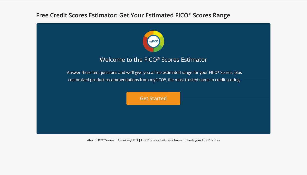
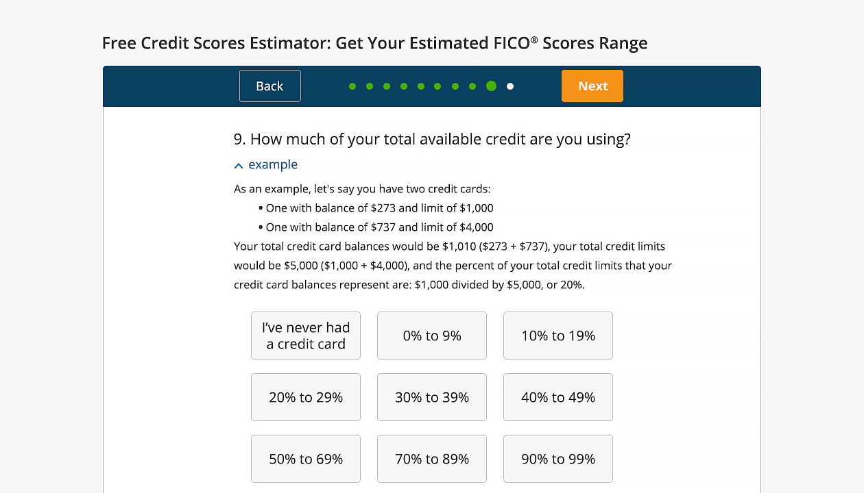
- Low hanging fruit - The low hanging fruit is to bump up the font size and remove all the noise such as clickable links and ads from the entire process of finishing the 10 questions starting from question 1 to 10.
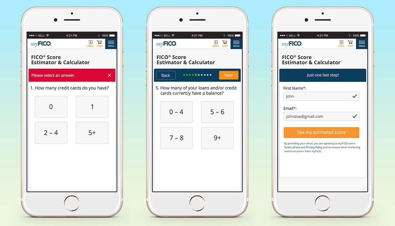
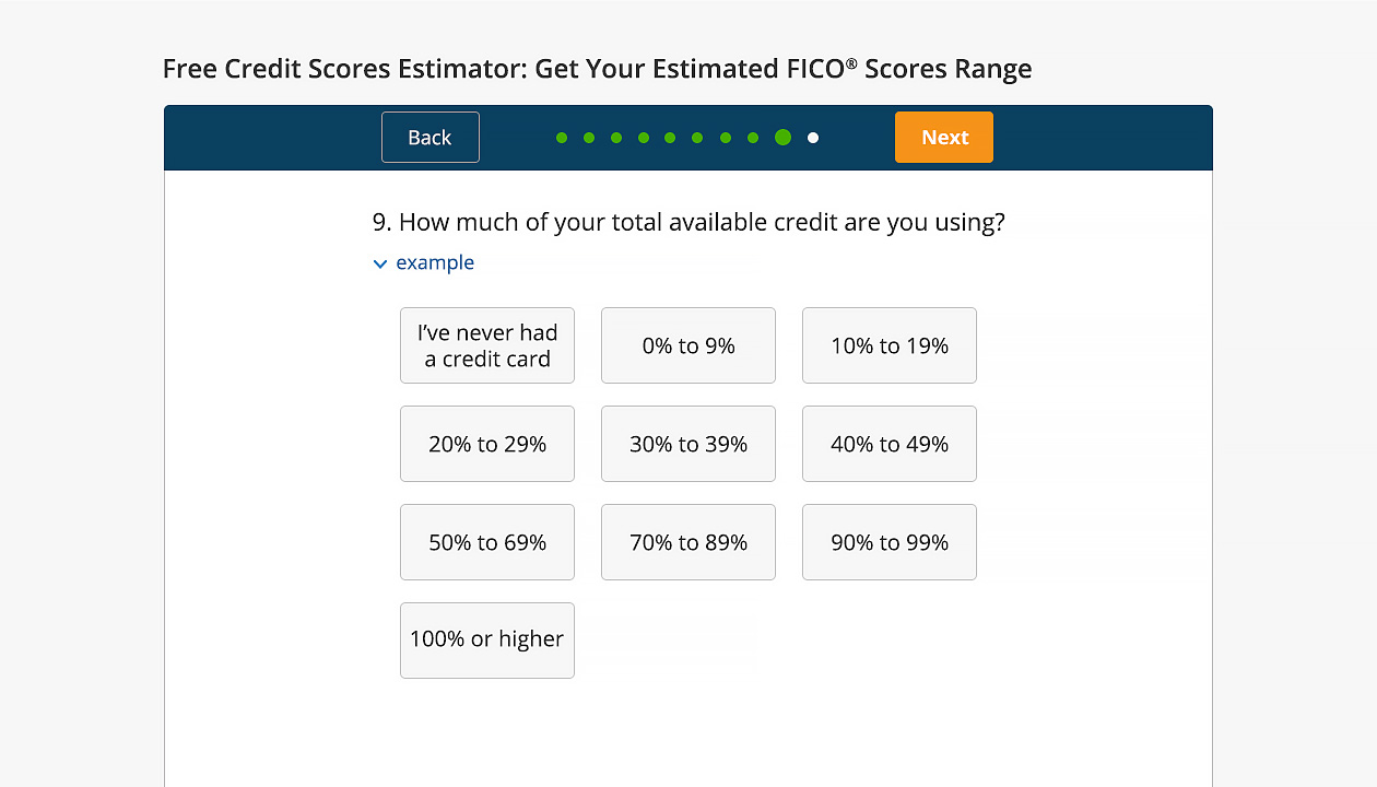
- Mental model match - Make the clickable target area for answers a lot bigger. Put each answer in their own single clickable box. It acts like the physical buttons we see in the elevator so it matches the users’ mental model to encourage them to click on it. I was trying to give users very clear cue or affordance in this redesign. I also give users clear visual feedback cues to let them know which answer was selected.
- Larger visual cue - I make sure users know which step they are at throughout the entire process. I also intentionally make the current step visual cue larger than other steps.
- Fitts’ Law - I make the next button stand out by using our CTA color which is orange. I also intentionally separate the back and next buttons to make sure there is enough distance because they serve different functionality. According to Fitts’ Law, two different purpose buttons should have enough distance between them. I also use different color and different format to differentiate them.
- Sticky controls - I make sure the steps, the back and next button are visible at all times no matter how far the user scrolls down the page.
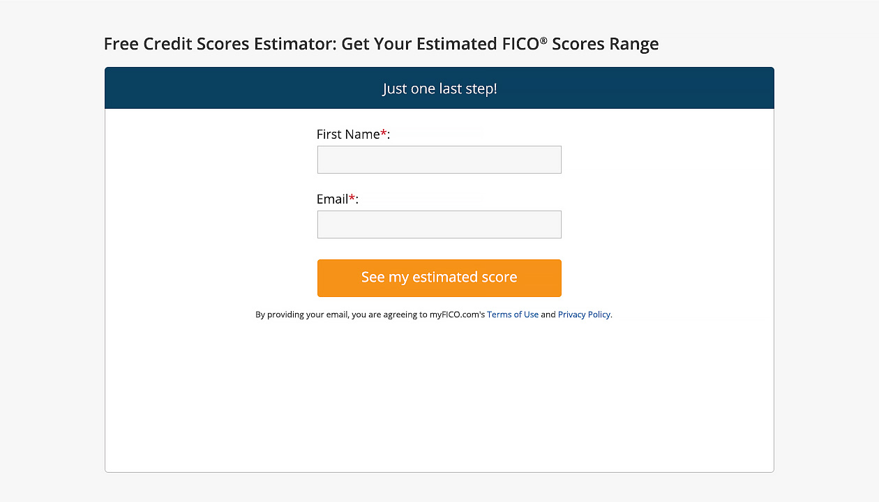
- Lead generation - Originally I was trying to attract new leads by collecting prospects’ email addresses one step before the users can see their estimated FICO Score as you can see in my design mockups. However, the engineering team said there were some technical issues so we didn’t implement this idea back then. Right now they think it’s a very good strategy and decided to add that in. It will be implemented soon.
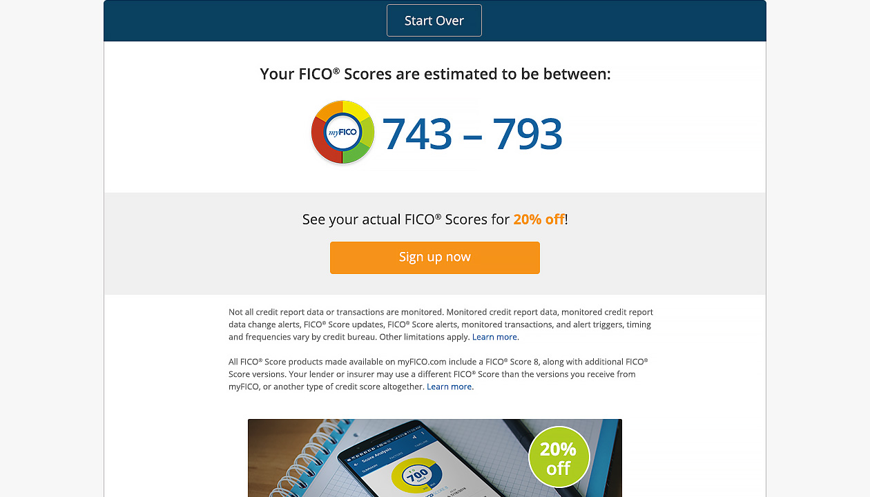
- Monetization - Originally I was also trying to monetize this wizard by adding some promotional banners on the last page where users see their estimated FICO Score to encourage them to buy our products with discounted price. You can see the design mockups I have in my portfolio. It wasn’t implemented back then but right now it’s in the project list which will be implemented soon.
Result
The completion rate surged to more than 90% from less than 55%.
