Project Details
"How can we create an intuitive mobile experience to help users easily find the properties they are looking for?"
Situation
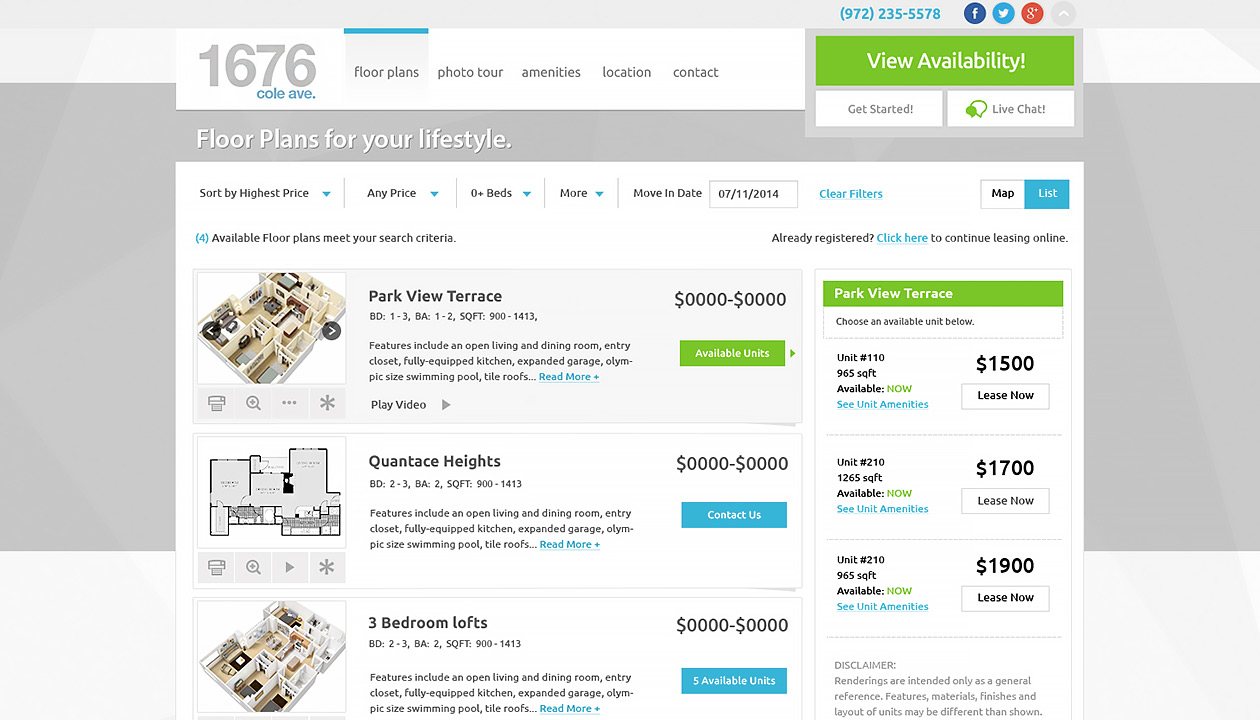
On the Realpage Lease Star design team, our responsibility was to productize the following tools for helping property management companies simplify the entire leasing process from search to payment.
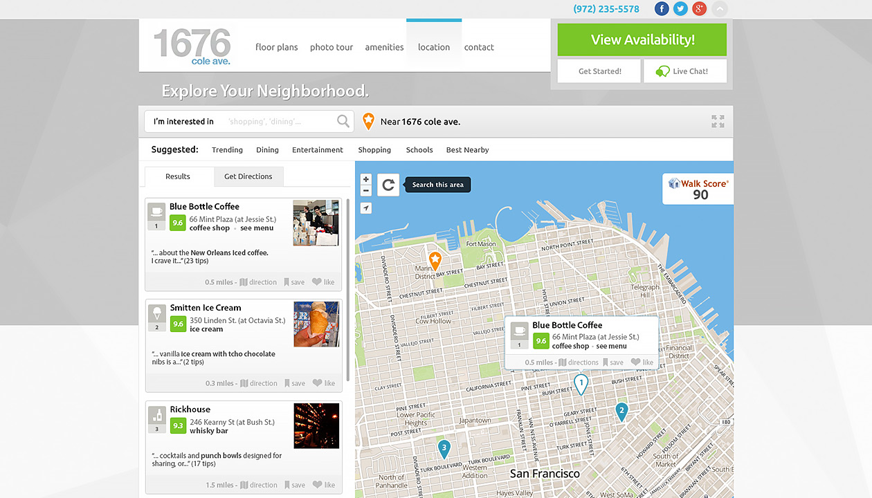
- The community search
- The map search
- The floor plan widget
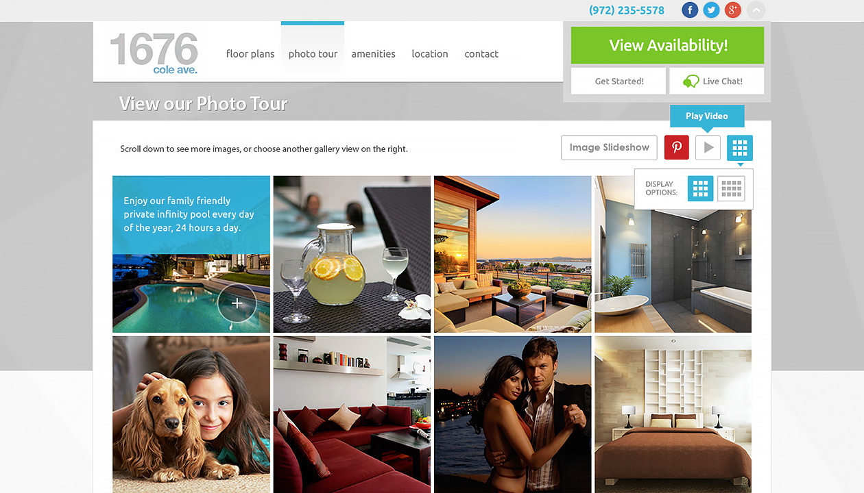
- The photo gallery widget
- The amenity widget
We packaged these tools into a product and sold it individually to integrate on our clients' websites. We also designed custom templates, standard templates or brochures when they wanted to pay more to get a custom service.
The problem back then was all our tools were desktop–based so we needed a mobile solution to improve accessibility for users on the go.
Tasks
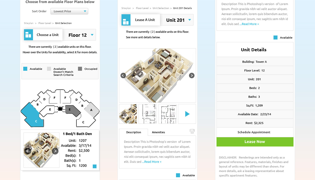
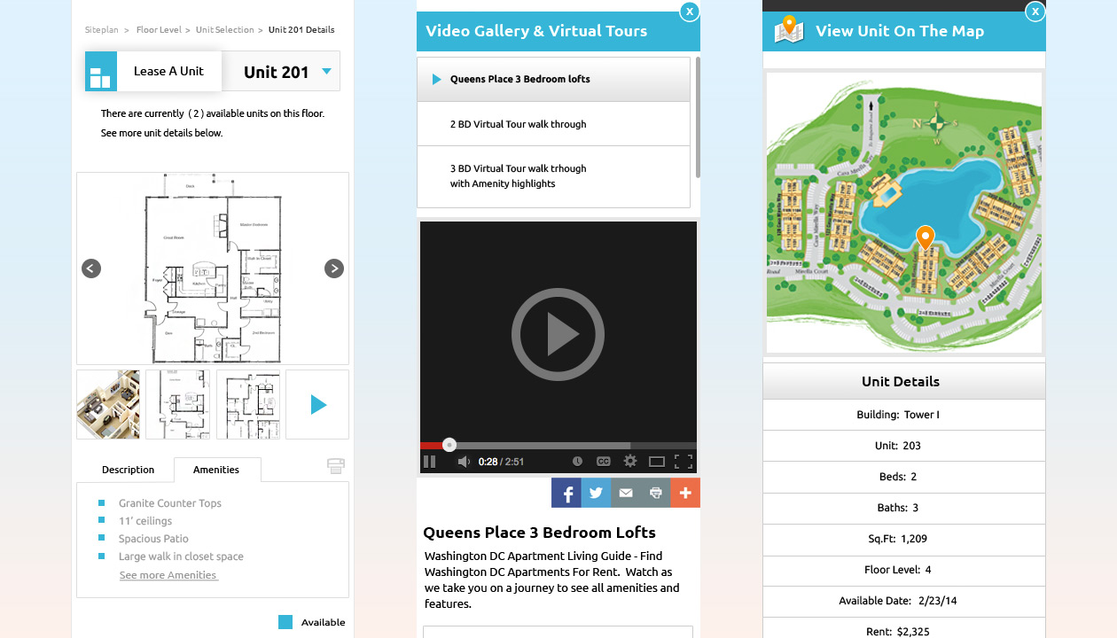
Since I have already developed the floor plan flow on the desktop with my manager and gotten it approved, I gained momentum in ownership over creating the mobile floor plan web app.
Action
I first ran a competitive analysis to look at what RealPage’s competitors did before I came up with my own solution. I started with rough interactive wireframes on paper and solicited other designers’ feedback. It turned out they loved my interactive paper wireframes so much so I started the digital wireframe to show the user flow before the visual design. I followed 4 main UX principles to design the mobile floor plan widget:
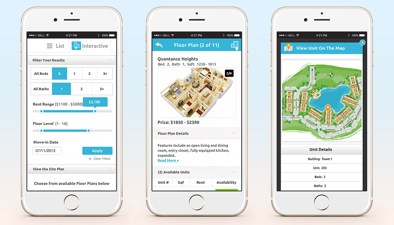
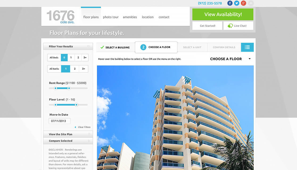
- Give users choice. - Instead of using a drop down select to choose numbers of bedrooms or bathrooms, I showed all the options up front so it’s one less click for users to choose and easy to scan.
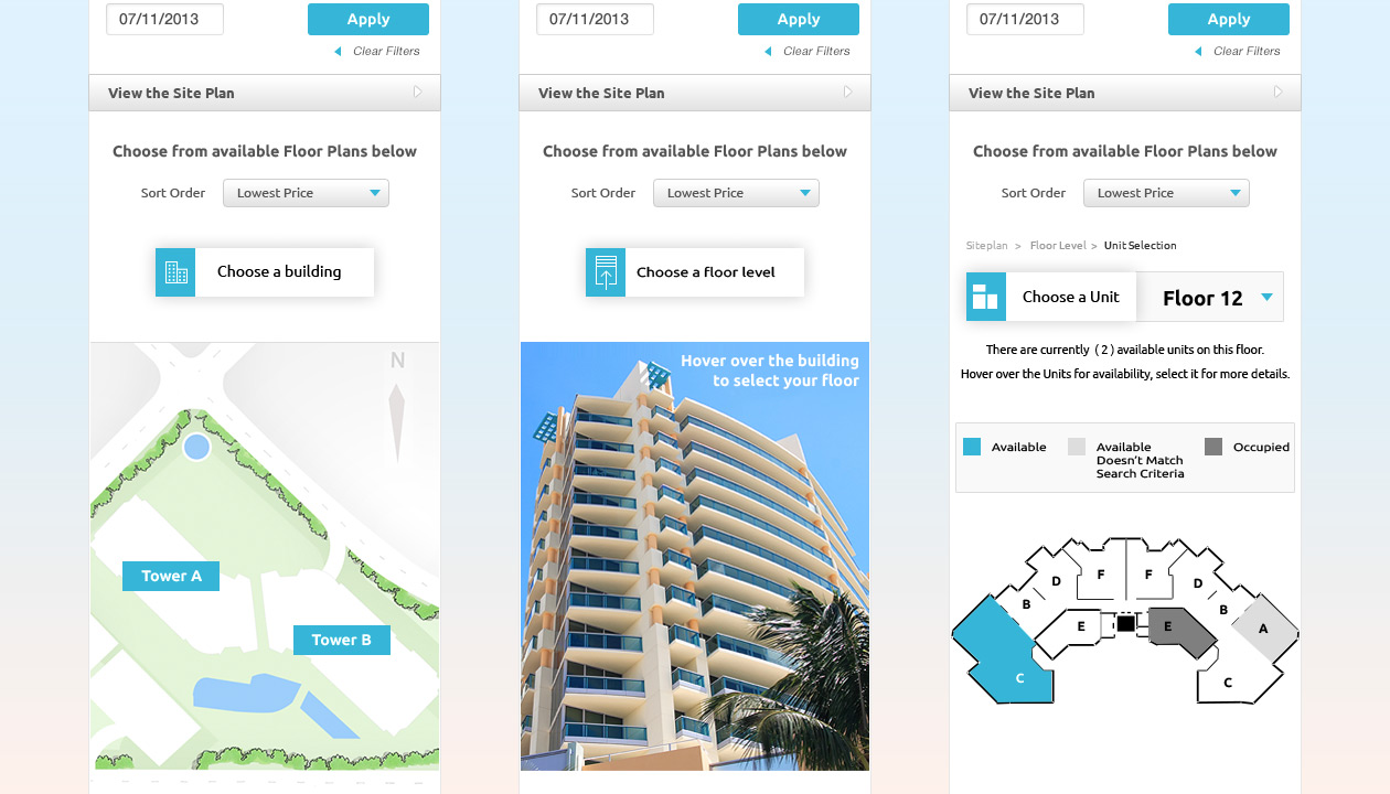
- Put users in control. - Users can control the rent range and floor level selection by using the slider.
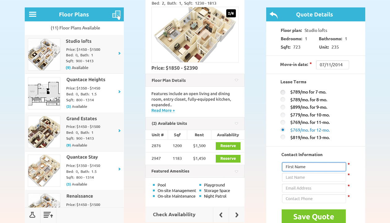
- Familiarity. - I used the same design pattern across devices, such as heading structure and all the design elements.
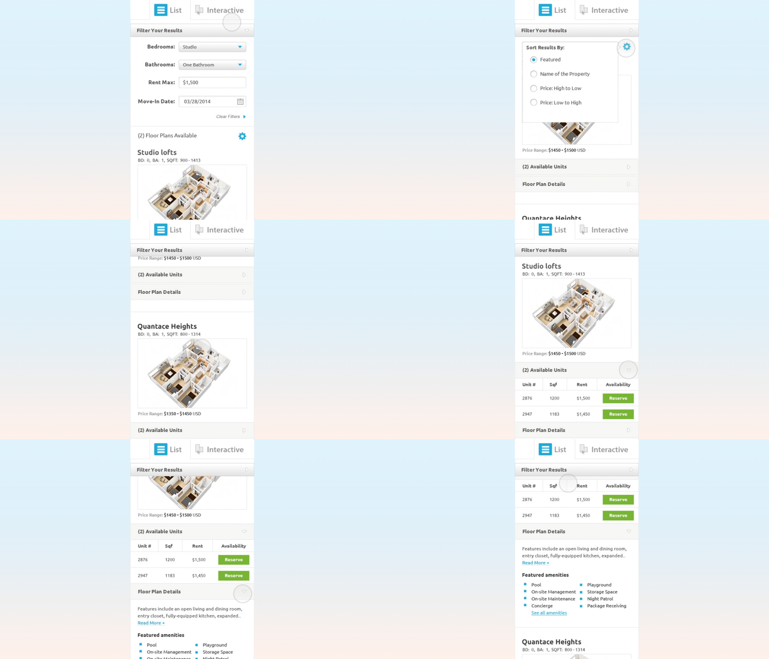
- Progressive disclosure. - I used the progressive disclosure design pattern on available units and floor plan details to avoid putting a long list of information all at once when the page first loads. The user decides which part of the information they want to learn more about by clicking on the down arrow to reveal more information. This way it saves real estate space on a mobile screen as well as showing users the schema of the grouped information before they dig further.
Finally, I also created icon fonts for developers to use on the responsive mobile web solution.
Result
It generated over $1 million revenue the first year we launched the mobile floor plan widget.
