Project Details
"How might we increase subscription revenue naturally via the consumer website without being pushy?"
Situation
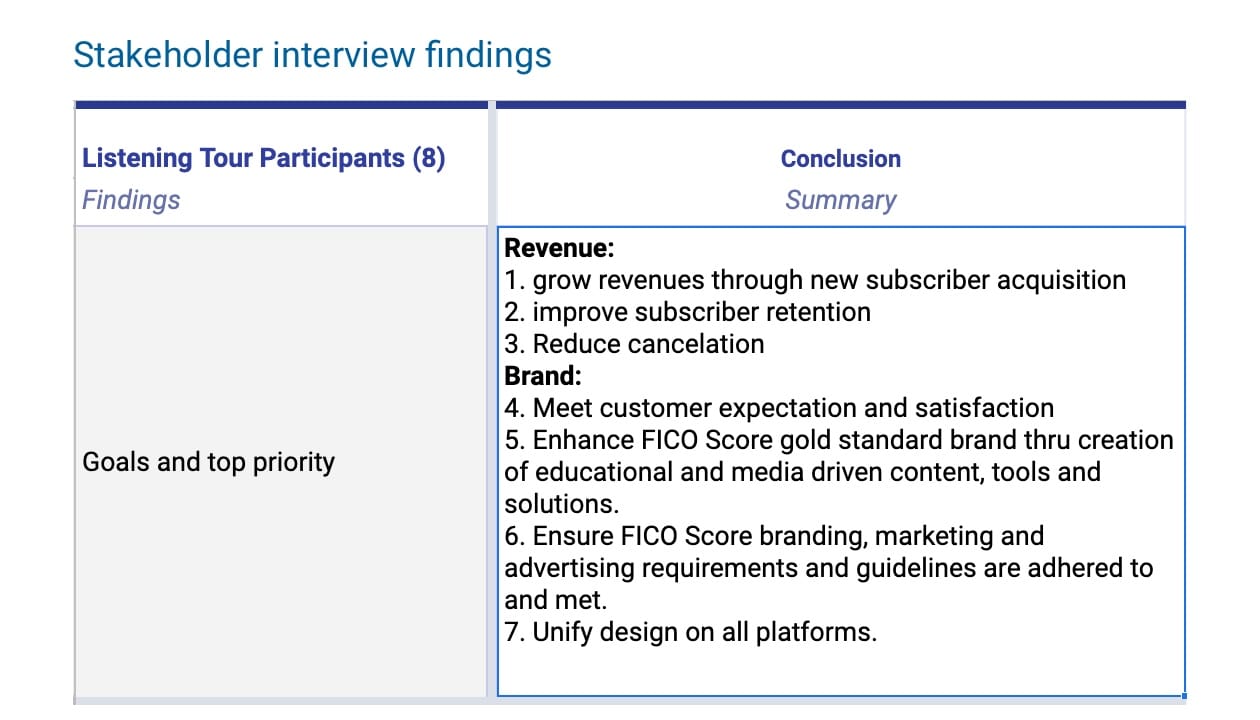
Based on the stakeholder interviews I conducted when I joined the team, I learned that the ultimate goal of FICO's consumer site is to have higher LTV (Lifetime value) and higher conversion rates.
When the analysts shared the data gathered on the previous version of the site (user-intent homepage), we learned that
- The exit rate is high when users go through the homepage user-intent funnel
- Most users go through the product offering flow from the global nav instead of the user-intent homepage flow
- The revenue was falling off compared to the previous year
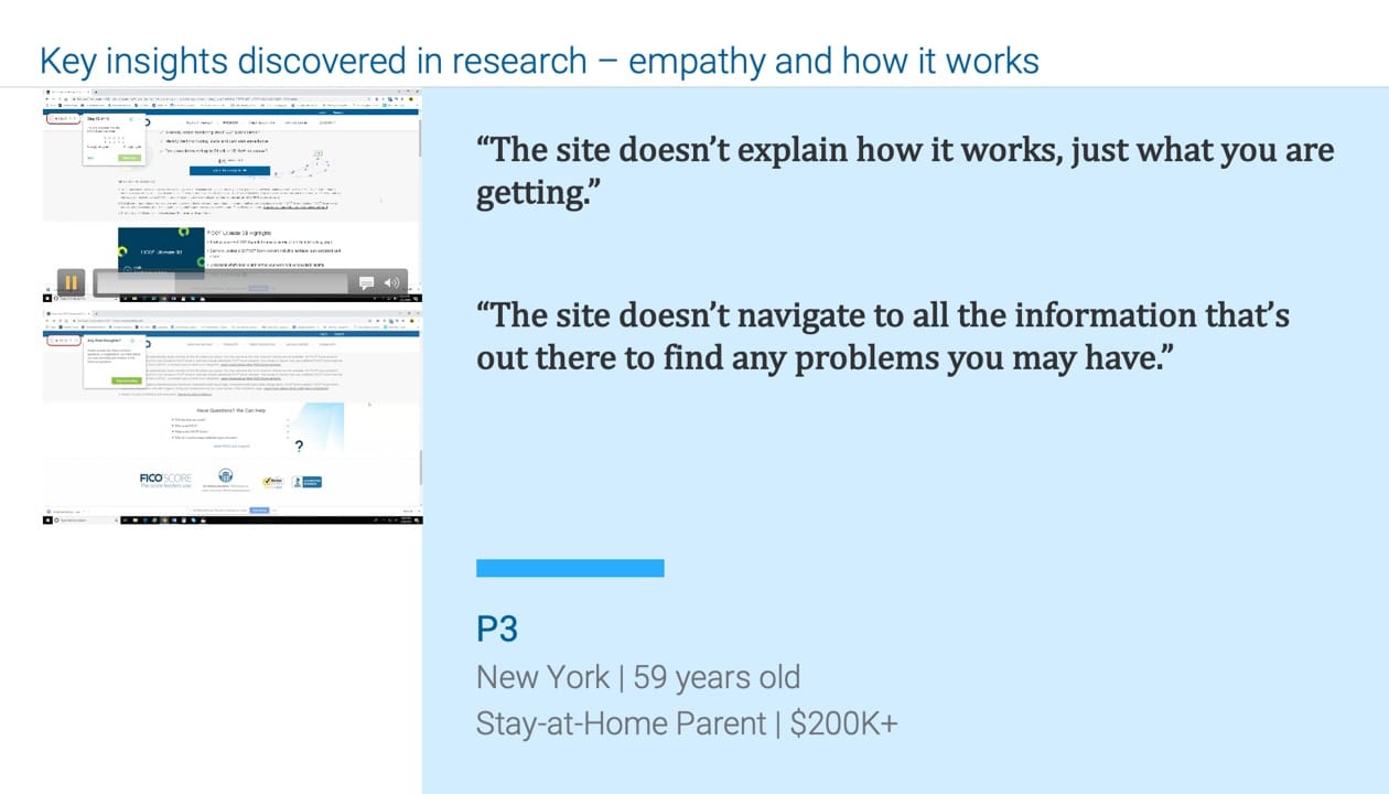
The key insight discovered from the usability study on the previous site was
- The site doesn't explain how FICO Scores work
- Users can't find the critical information that will affect their credit
To address this, we want to do a site redesign to create a product-focused homepage and use friendly language to explain how complex FICO Scores work to get users comfortable with buying products to increase LTV.
I worked with another designer who focused on content design, specifically to explain FICO Scores. I mainly focused on overall product purchase flow strategy and branding visual language.
Tasks
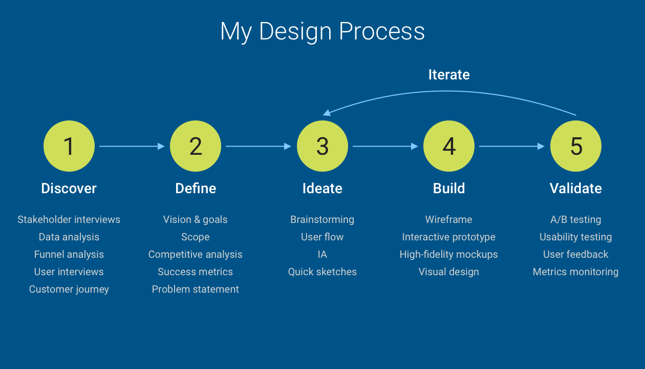
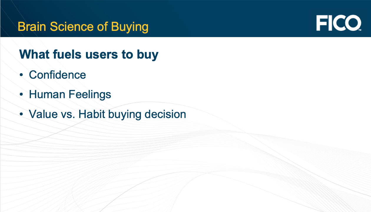
My goal was to come up with a new design strategy and a new purchase flow by applying cognitive science brain theory – users make confident value-based decision by comparison.
- I combined the competitve analysis and the buying brain theory hypothesis to create the conceptual prototype design flow.
- I validated the prototype by recruiting participants and conducting usability tests to make sure the new product purchase flow and interaction made sense to the participants.
- I iterated on the prototype based on users' feedback prior to creating the actual detailed visual design
- I shared and discussed visual language ideas, color theory and illustration styles with stakeholders to collaborate on the final branding direction.
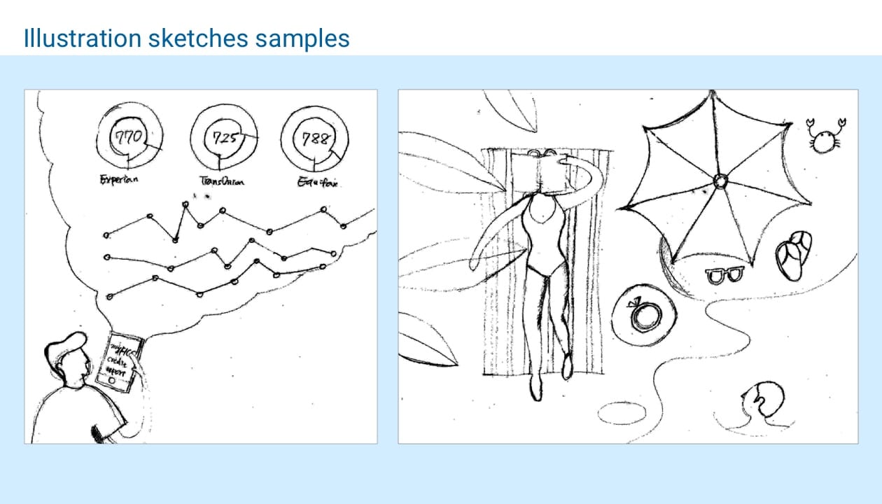
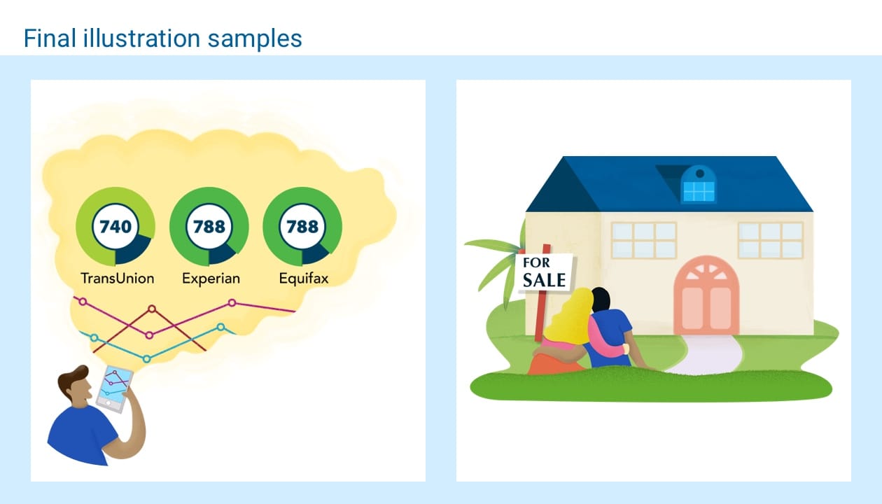
- I drew the illustration sketches, wacomed the final illustrations, and created the icon libraries.
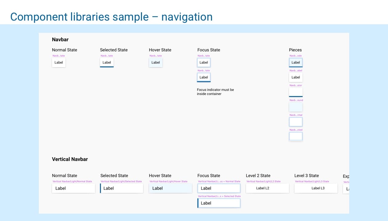
- I worked with another designer to complete the component libraries for this project.
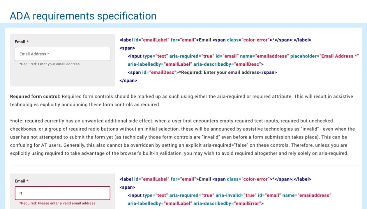
- I created the ADA requirements specification on form fields for our engineering group.
The minimum goal was a 5% increase in LTV.
Action
Research step:
I started out by looking at some of our past research data with team members including:
- Target audience by economic cohorts
- The key differentiator for the FICO Score
-
The value of our products
- What features our users care about the most
- What tools do users use the most in our product
- What information brought the most attention for our users
- What confuses the users
- What keywords users put in the queries the most
- What paths users take before they make the purchase
Gathering all this background information helped me back up my design strategy.
Flow step:
First-time visitors who are aware of the brand:
60% of our traffic is from SEO
This suggests they come for the brand. That also means their entrance may not always be the homepage; it may be product details, score estimator or credit education pages. It's crucial that we know how to grab users’ attention and that we make sure they know what our product offers right away when they land on the page. In order to achieve this, we decided to
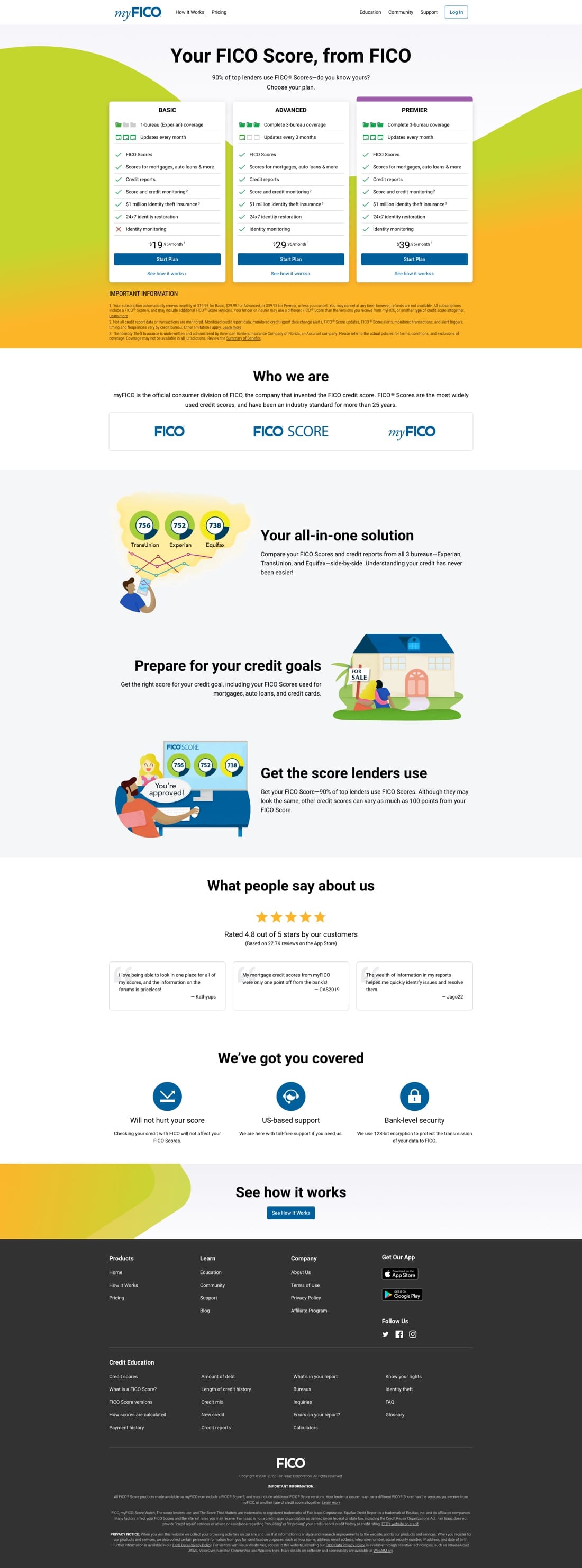
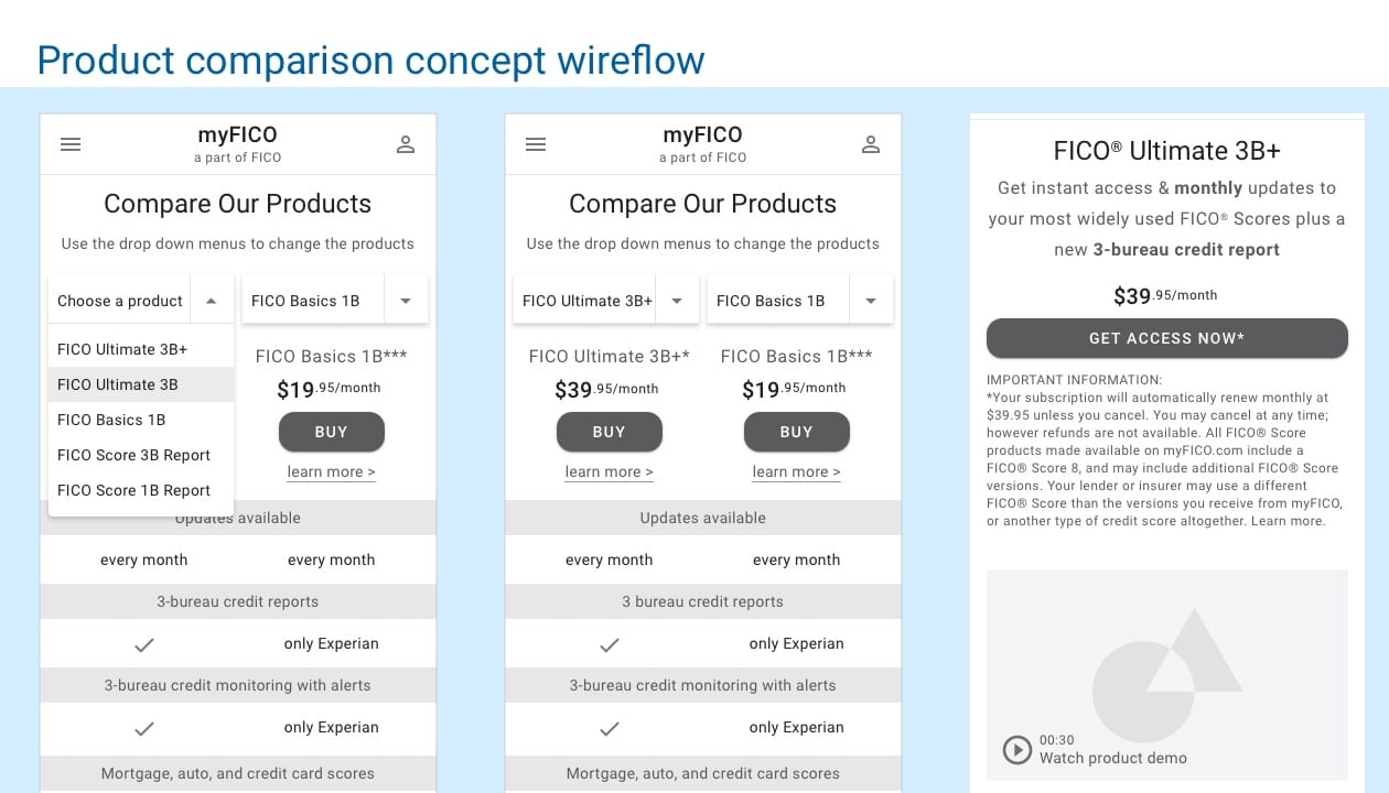
Put the product comparison right on the homepage above the fold.
This ensures users know what they are getting for each product; for example, I put 3-bureau credit report, 3-bureau credit monitoring with alerts etc in the comparison table. During the usability test, most users care most about these features so I want to make sure they compare these features first before they see the price.
By providing enough easy to understand product features and offerings as well as high quality educational content, we can help establish brand loyalty with users who are aware of our brand.
First-time visitors who are NOT aware of the brand:
For users that are still in the research stage, such as comparing our services with other companies, we have several options to help them understand myFICO and choose a product that fits their needs. For example:
I added the FAQ section including questions like
- Who is myFICO
- The difference between FICO Scores and other credit scores
- How to cancel
By highlighting the most asked questions from our users, we not only can reduce the customer service call volume but also be able to direct them to other pages of the site such as credit education to reduce the single page bounce rate.
Design thought process:
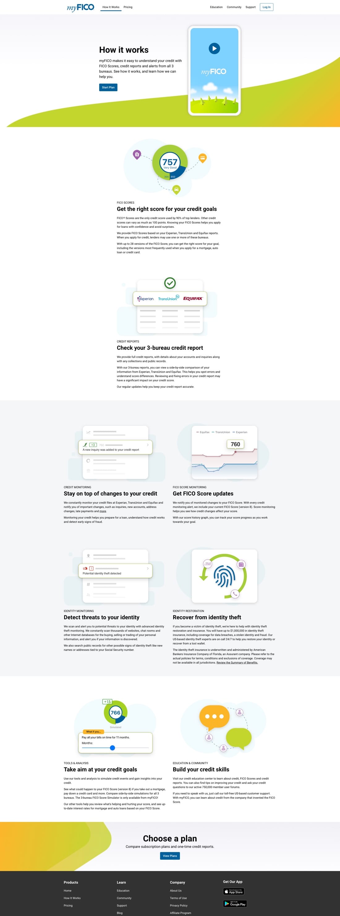
- Intuitive brand: I used a vibrating design style to soften the complex FICO® Scores concept and make it more user-friendly to consumers. According to our user research, FICO® Scores are still a mysterious and confusing topic to consumers.
- Product demo: I included a product demo video feature to let users quickly get a glimpse of what our product offers and how our mobile app looks.
- Content Hierarchy: Typography makes communication clear and conversational. The redesigned consumer site is very typographic because it has lots of quality content aka text. I leaned on text to facilitate communication between users and myFICO. Variation in type sizes throughout the layout helps users quickly decode content hierarchy and identify the pattern of typography hierarchy. Typography plays an important role in visually supporting the page’s information hierarchy, drawing the eye to important headlines.
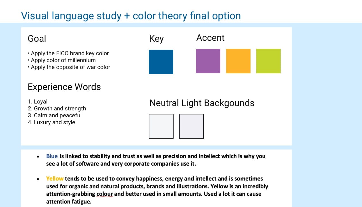
- Color: Color proved to be a key technique in directing a user’s attention to important messages and actions in the interface. The strategic use of tetradic harmony colors of our primary blue #00609C injects personality and a sense of reward, enhancing the tidy UI. The use of elevation and a responsive layout grid also contribute to the revamped user experience.
- Micro white space: Users get frustrated when information bombards them. We’re humans, not machines. White space calms us, letting us “breathe”. White space is a great tool to balance design elements and better organize content to improve the visual communication experience. It is crucial to hold user’s attention on a text-heavy page. White space is the real star of the show because it keeps pages from looking busy. I wanted to craft an uncluttered interface for the myFICO site redesign.
Result:
The end-to-end FICO consumer site redesign resulted in an increase by 80% of new paid subscription revenue after 1 year.